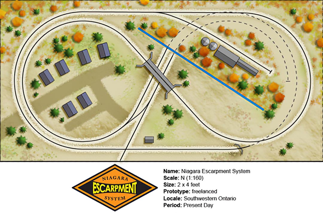
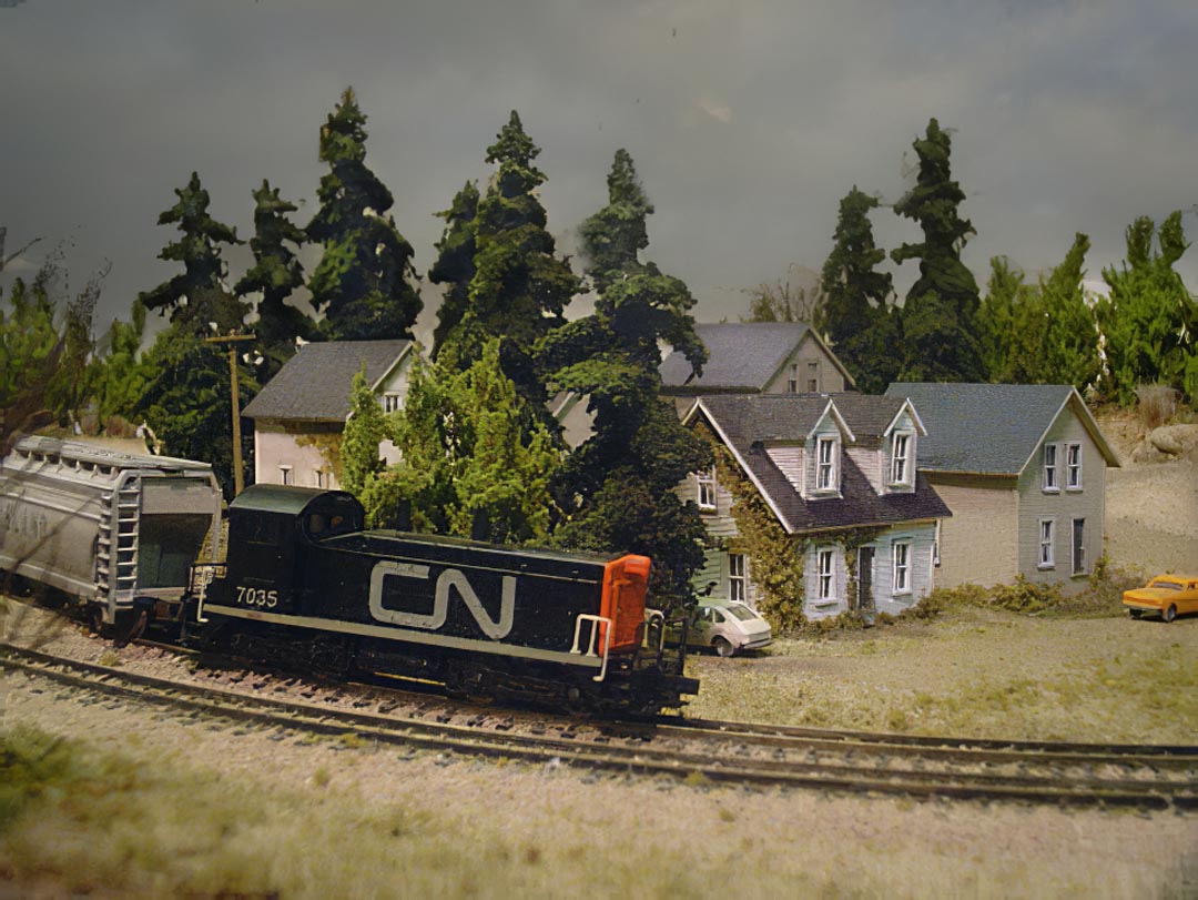
The Niagara Escarpment System (NES) is a small, modern-day freelanced railroad set in rural Southwestern Ontario, Canada. While not specifically based on any particular railroad, the NES takes some inspiration from the Guelph Junction Railway – a small branch line operation managed by the Ontario Southland Railway.
In designing the NES, I made a list of practical features I wanted, as well as a list of design elements I wished to include. As this is my first layout, (aside from my childhood 4’x8’), and my first attempt at N scale, I wanted the layout to be fairly small and portable. Likewise, I wanted to take advantage of the small collection of engines, rolling stock, and track work that I had collected over the past five years. Finally, I wanted the project to be ‘hobby shop independent’, meaning that the construction techniques and scenery methods, could be done without visiting hobby shops.
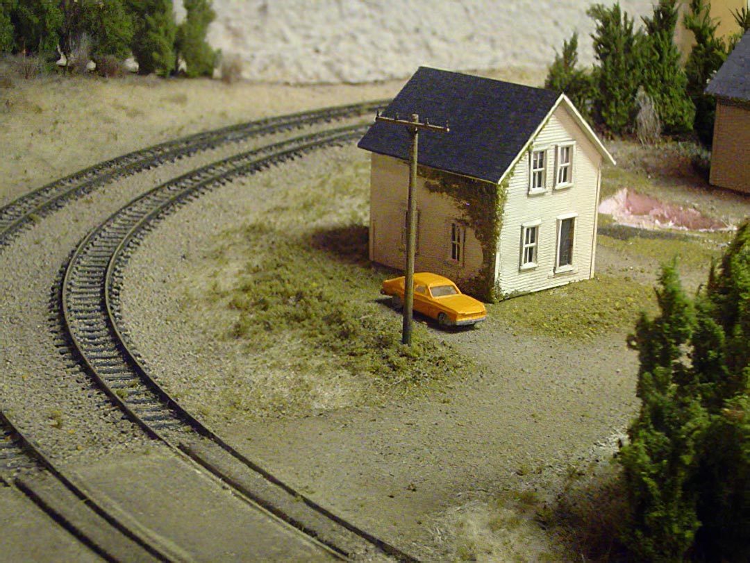
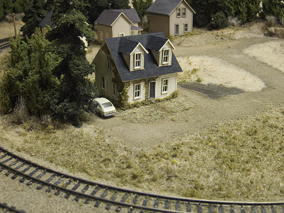
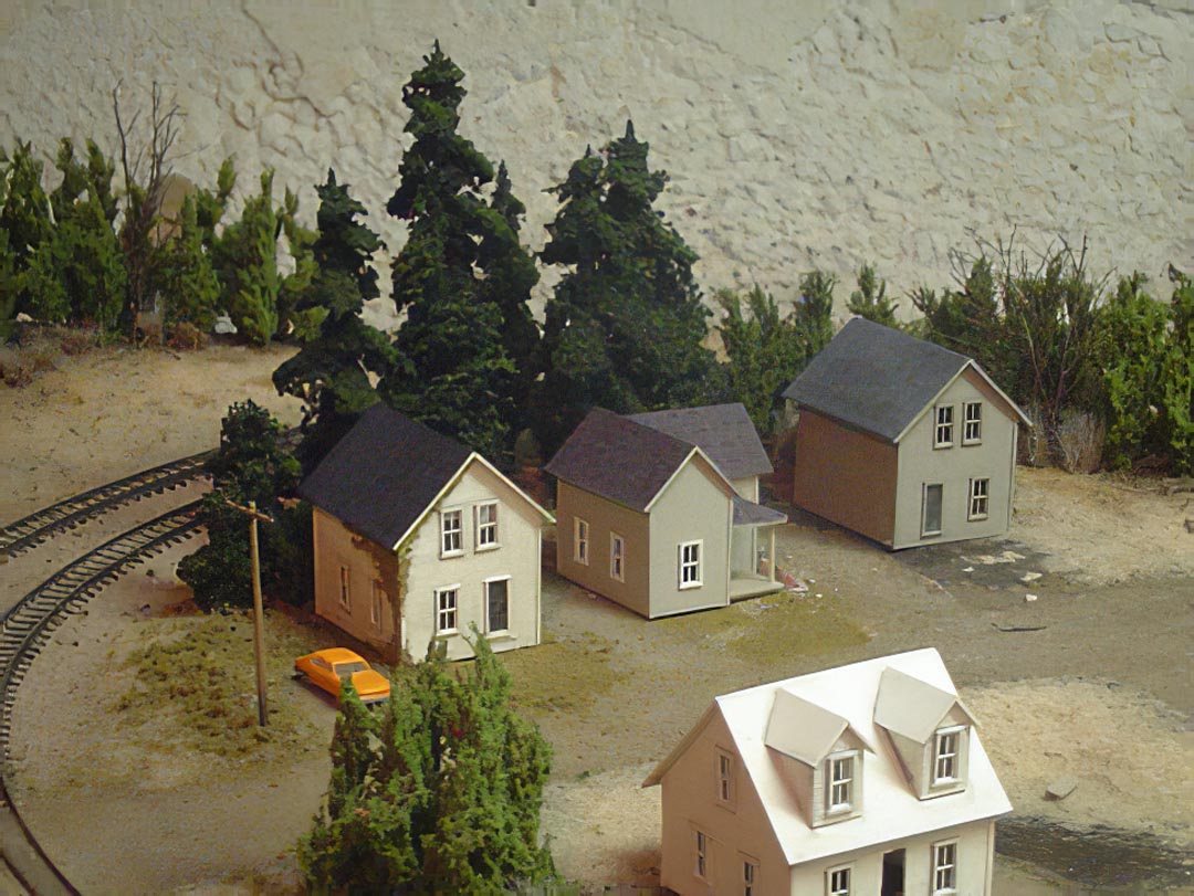
For the design, I wanted a plan that was continuous run, modelled a plausible railway design element, favoured scenery over track work, and could be divided into two separate scenes for scenic diversity. As well, I wanted to try to capture the essence of the Niagara escarpment and its surroundings in early winter.
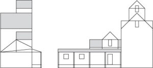
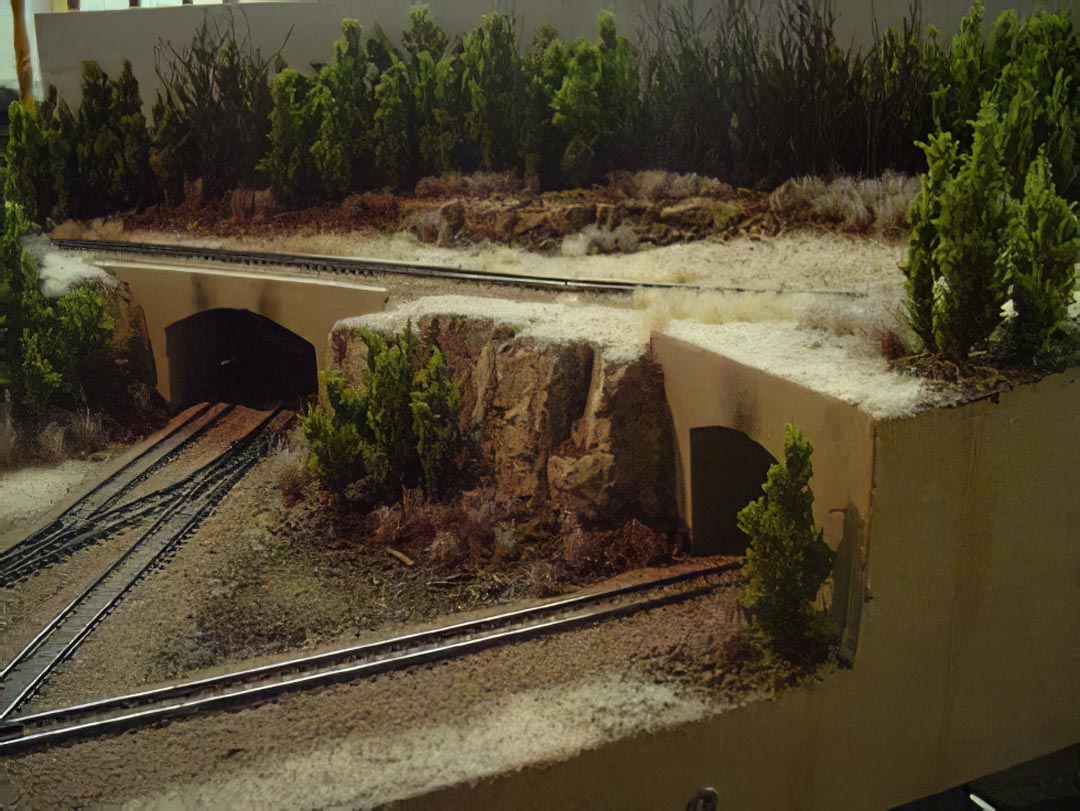
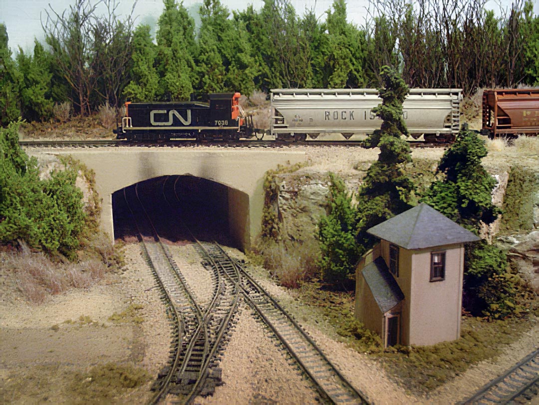
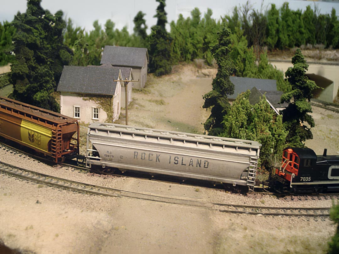
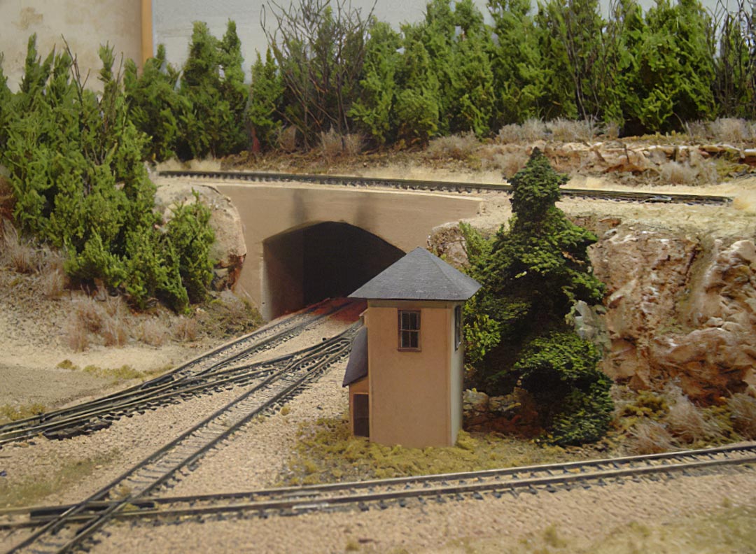
I developed the following 2’x4’ layout. The design is a basic folded dog bone, with one small industry, an interchange, some hidden staging, and a small town. Overall, the plan allows for a decent amount of scenery, and while continuous run, should look less toy-like with the tunnels and the view block.
I designed a herald for the railway based on the design used by the East Troy Electric Railroad’s insignia.
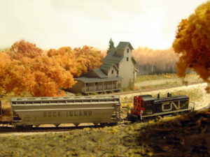
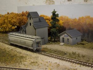
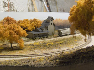
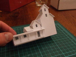
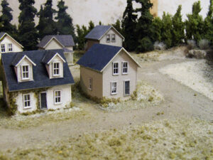
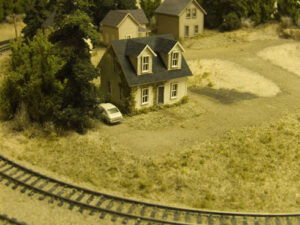
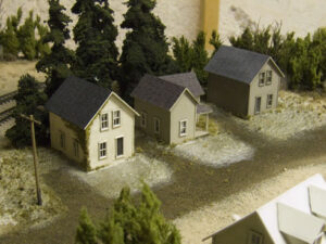
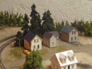
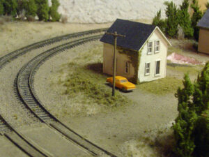
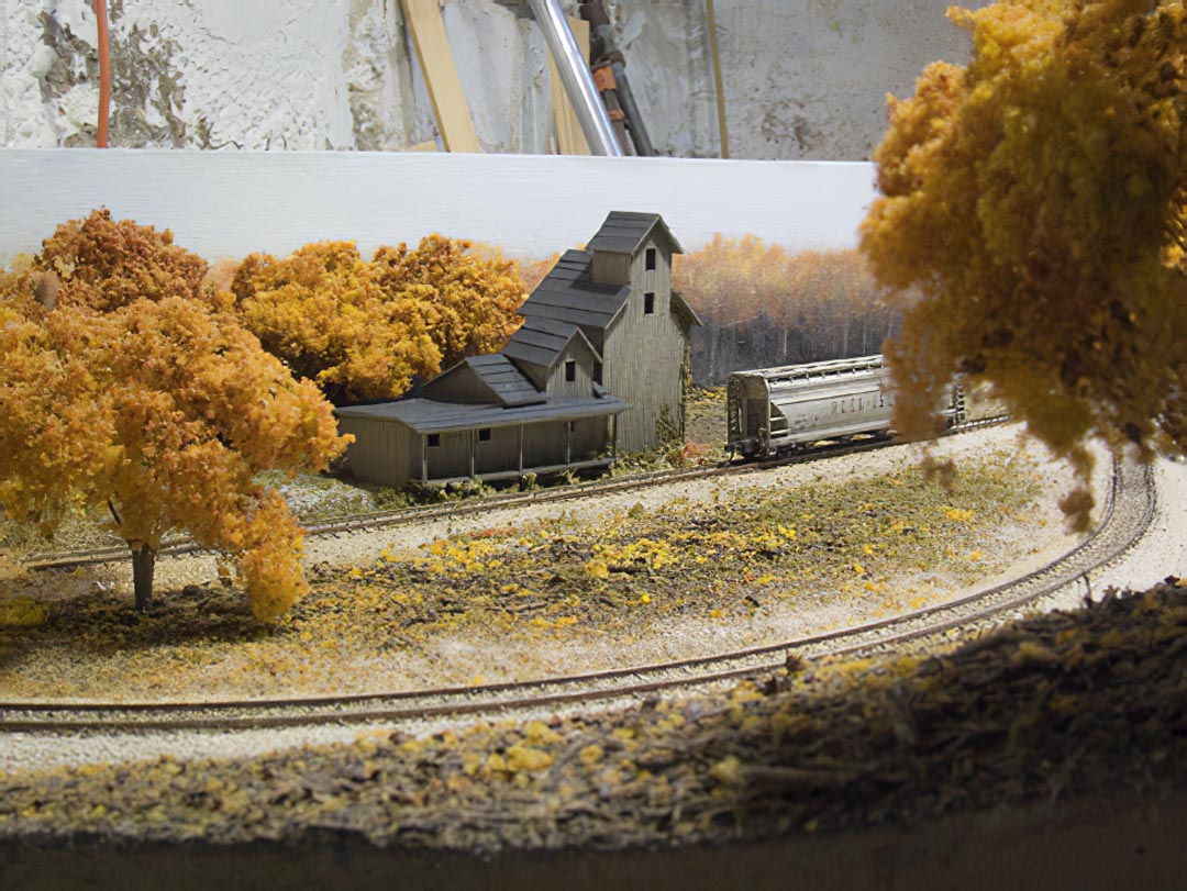
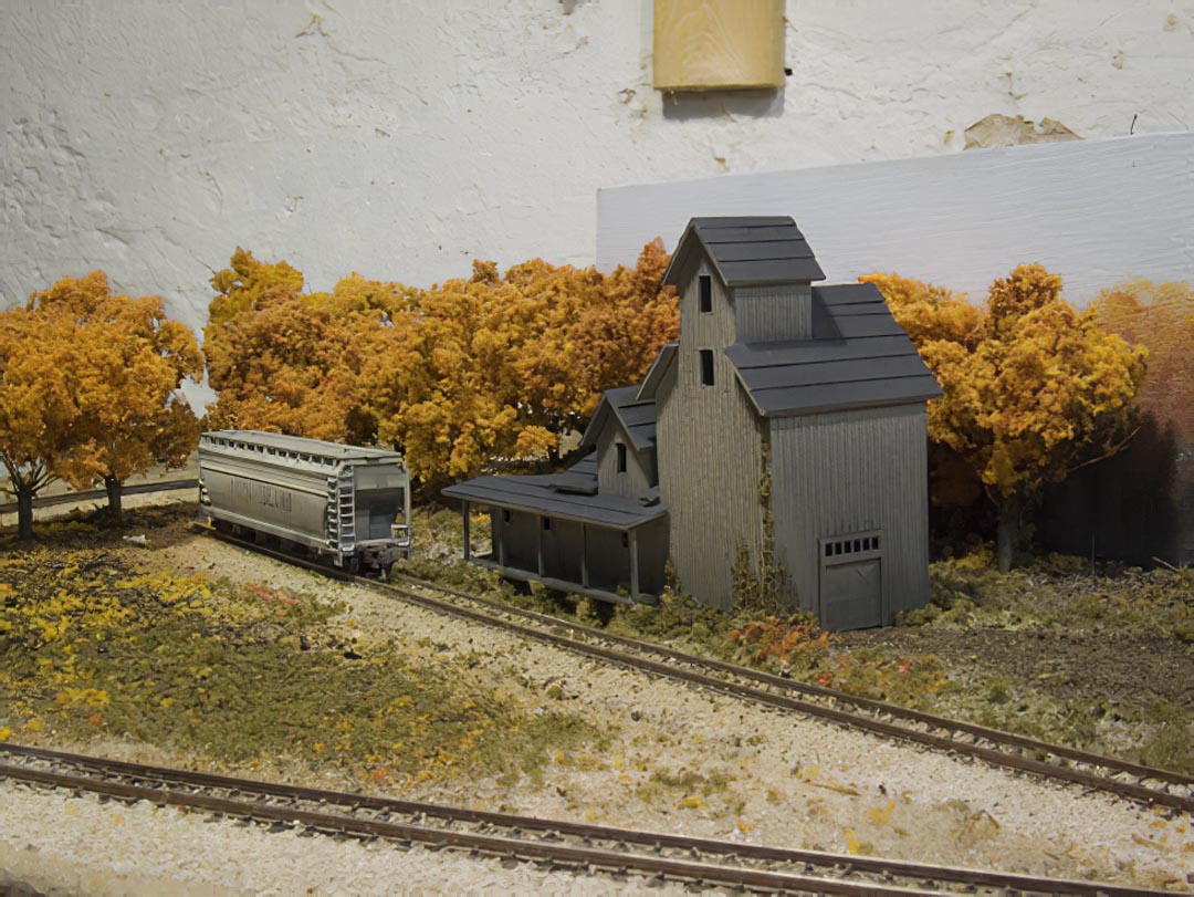
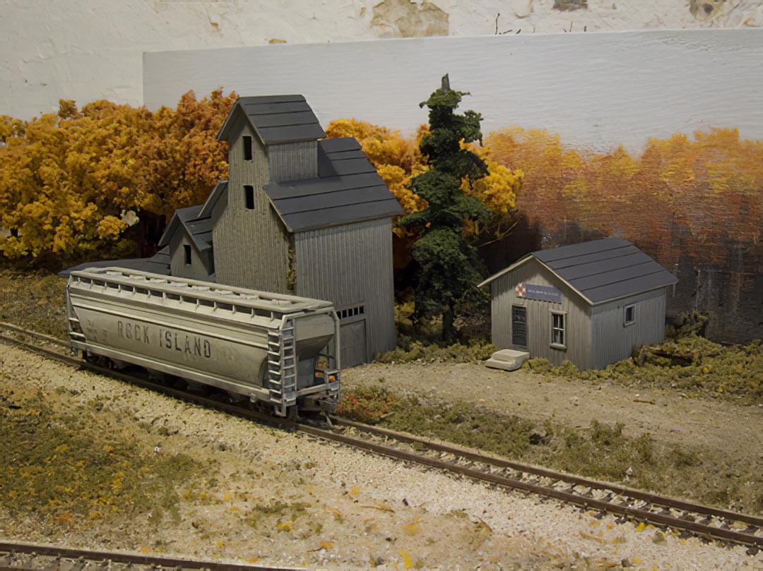
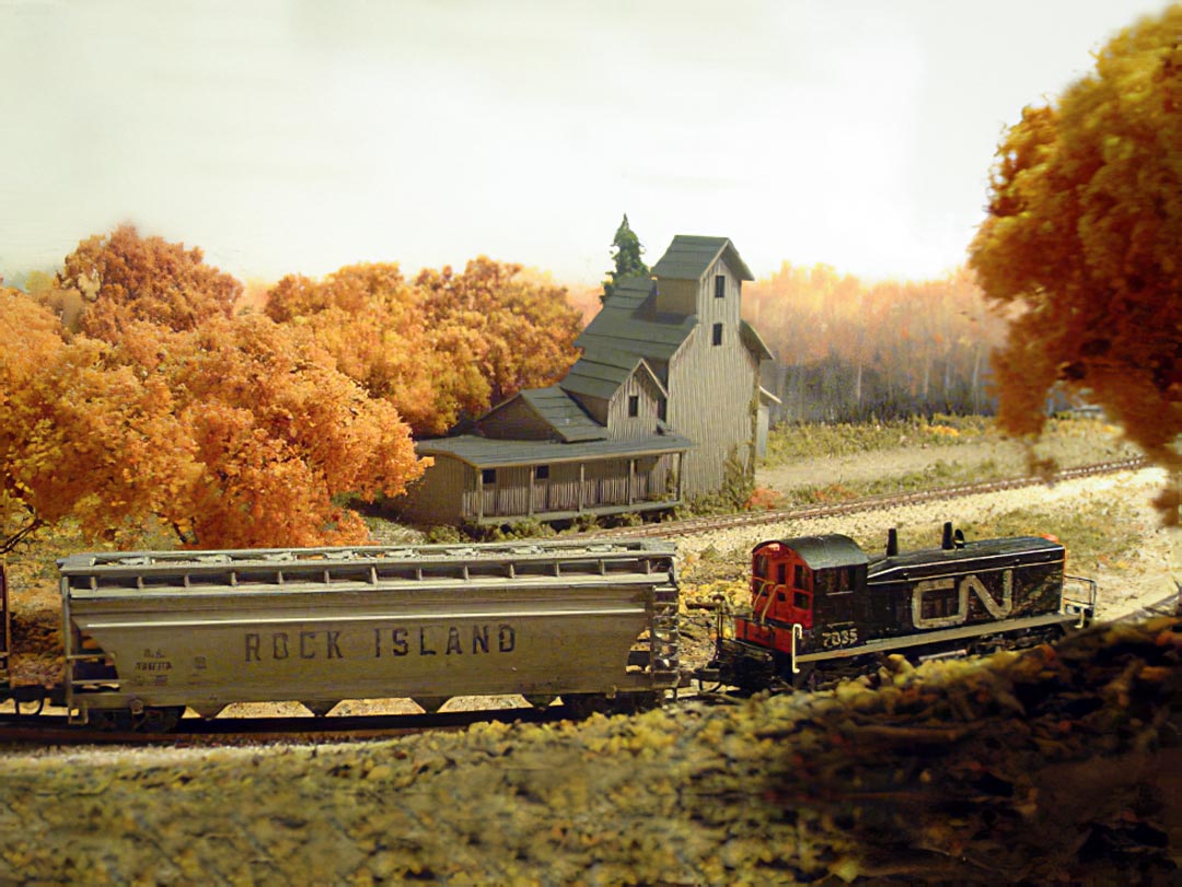
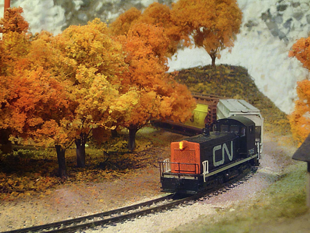
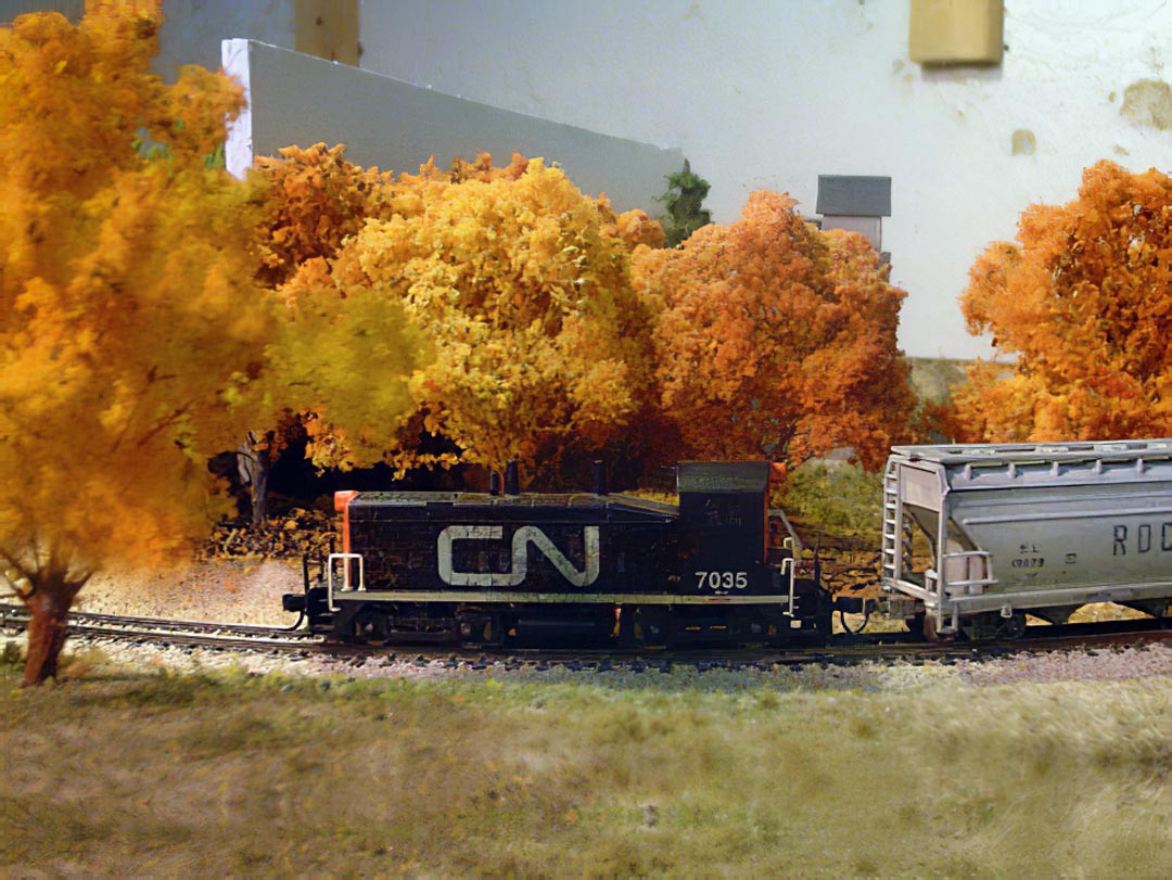
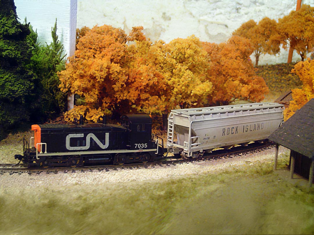
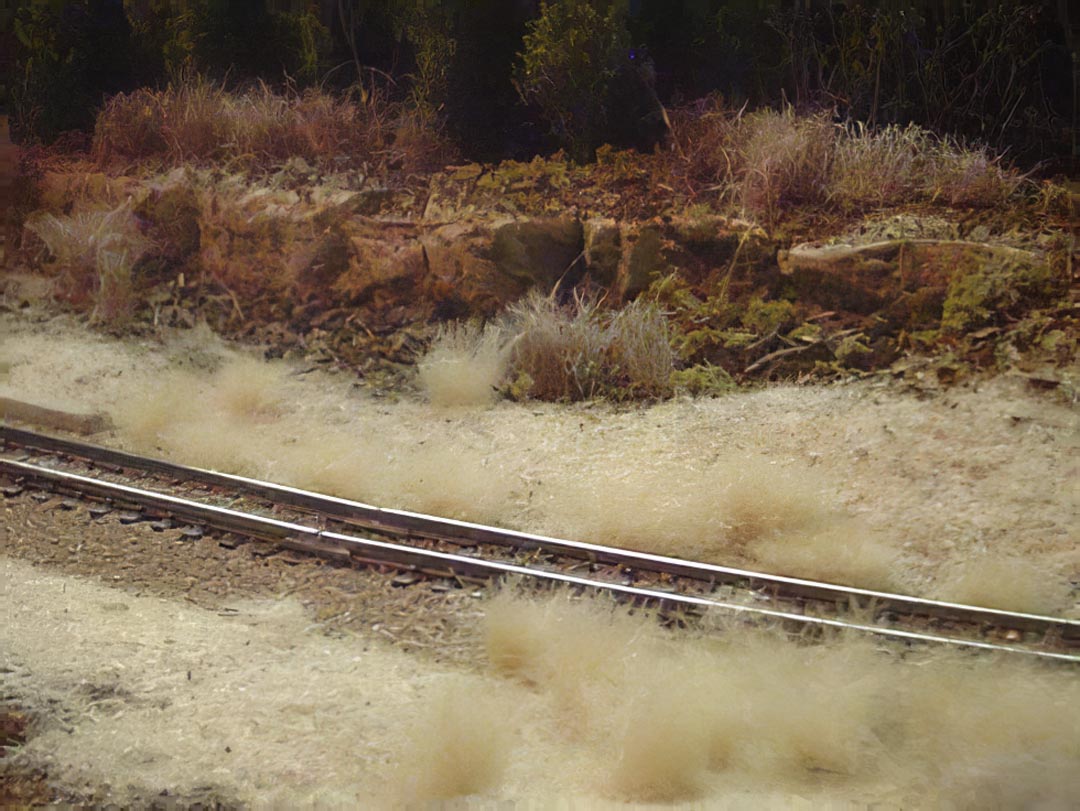
The railway was completed and donated in 2008. Only these moderate-quality photographs remain.